Bing Webmaster-Clarity Series #3: Scroll map – what can it do for you?
You have probably heard that to be successful you need to be data-driven, only if it was that simple. Collecting data is the easy part; figuring out what matters and how to use this information to your advantage is a lot more difficult.
Here to save the day are click maps – a simple yet powerful heatmap tool that makes it easy for you to collect, visualize and understand your website’s analytics data.
In this article, we will cover the basics of click maps and share some tips on how you can use click maps to get more meaningful engagement for your site.
What is a click map?
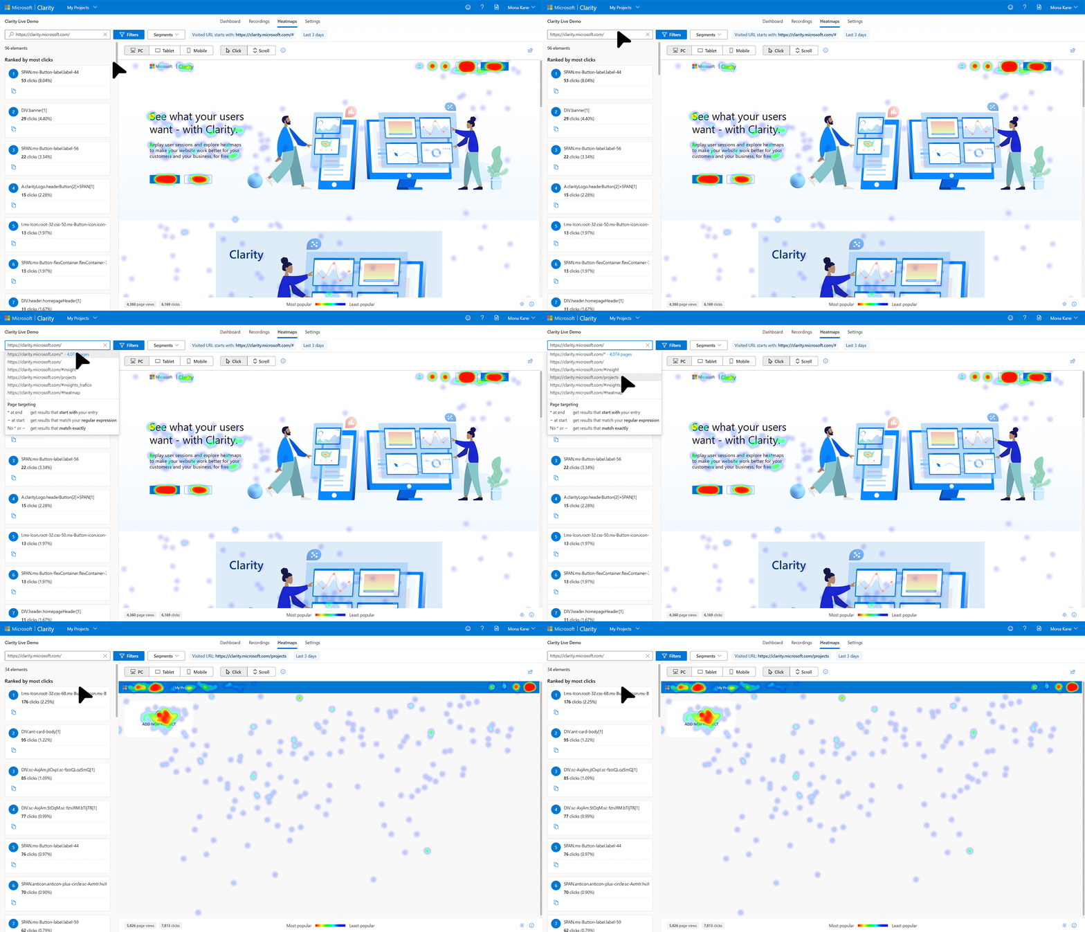
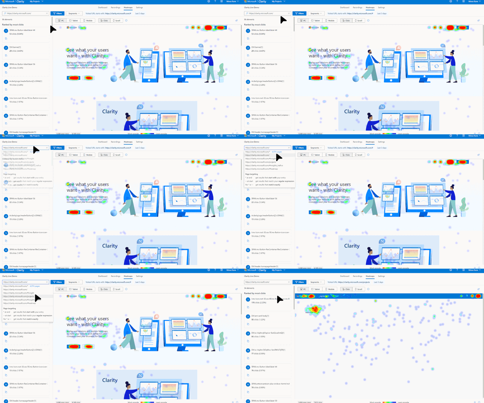
Click maps are a type of heatmap that showcases where on your website your users click with their mouse (desktop) or tap on their screen (mobile device). It can help you understand how your audience interacts with your business. You can use this information to improve both site experience and sales conversion.
The colors on this heatmap show how hot web page elements are (or not), based on click data.
- Warmer colors showcase high visitor engagement
- Cooler colors showcase lower visitor engagement
How are click maps created?
Click maps are made of two layers. The bottom layer is your website, and the top layer is the heat from the clicks.
Analytics tools that provide the click maps feature (Clarity being one of them) will track your users’ clicks as they happen on your website. For each click, the tool will record both the element that was clicked and where in the element it was clicked.
When the heatmap generates the click map, the process looks at all recorded clicks for a given time, page and any other filter you might apply. There might be thousands of sessions within these filters and all that information is compiled so that for each element we have the number of clicks and the location within the element where the click happened.
Once this list of clicked elements is created, each is checked against the bottom layer (that is, your website) to see if it is shown there. If it is, then the heat there is increased by the number of times there was a click there.
Get free click heatmap for your site to help you and your team make data-driven decisions faster with Microsoft Clarity.
Why should you use click maps?
Click heatmaps are crucial for user experience design, usability research, and optimization because they allow companies to see what users do on their websites. Here are just some of the reasons why:
- Identify which parts of your website are getting the most attention and which ones need improvement
- Find and fix bugs that lose the users attention
- Save time by analyzing data visually
- Show engagement data graphically and share dramatic visual presentations with your team
What makes Clarity click maps unique?
Using Clarity for your click mapping can make a world of difference.
1. Instant results, No generation wait time
You can start seeing data for your website immediately.

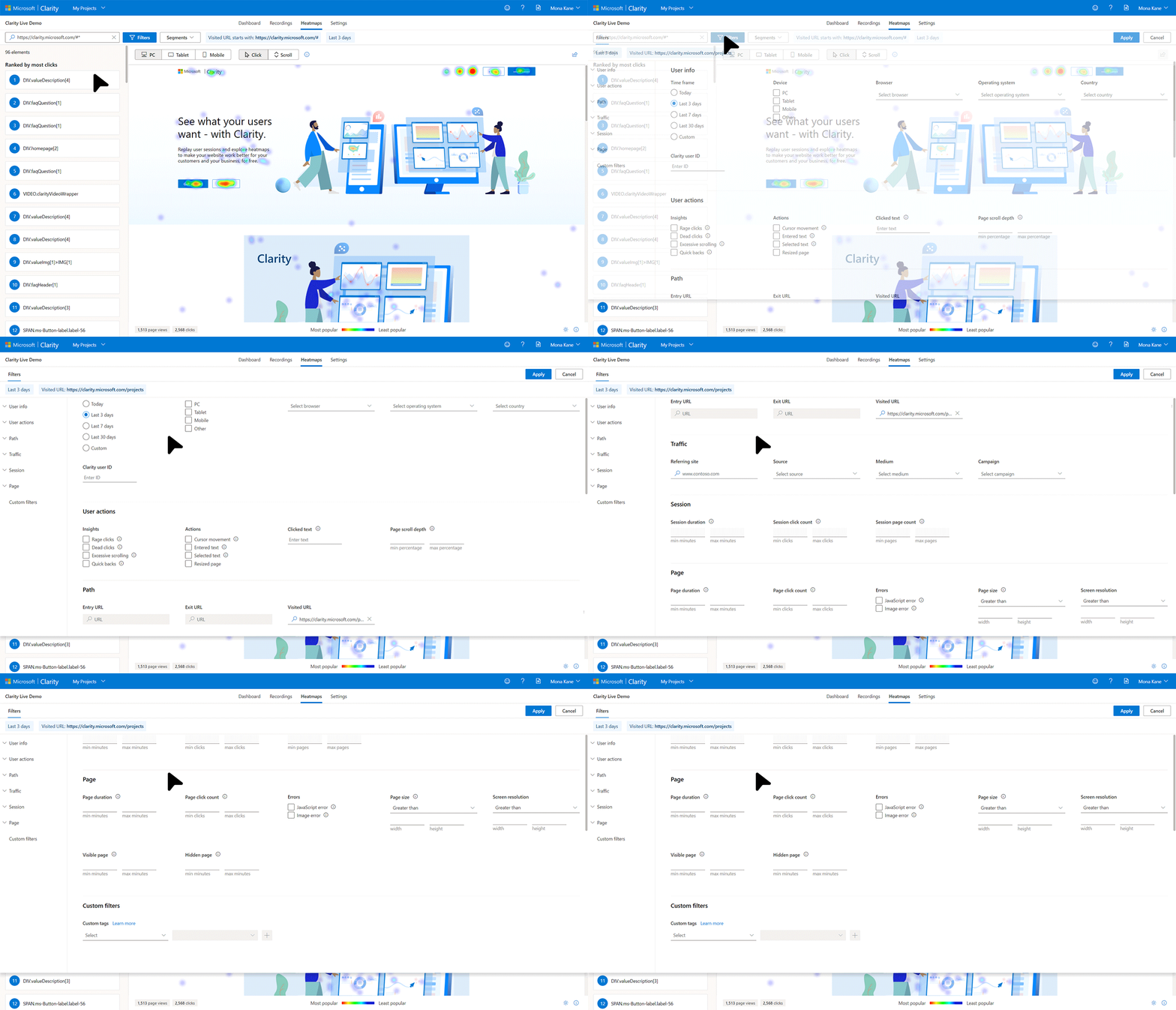
2. Slice and dice your results with rich filters on-the-fly
With our rich set of filters, you can narrow down to a specific audience and see how the click patterns change.

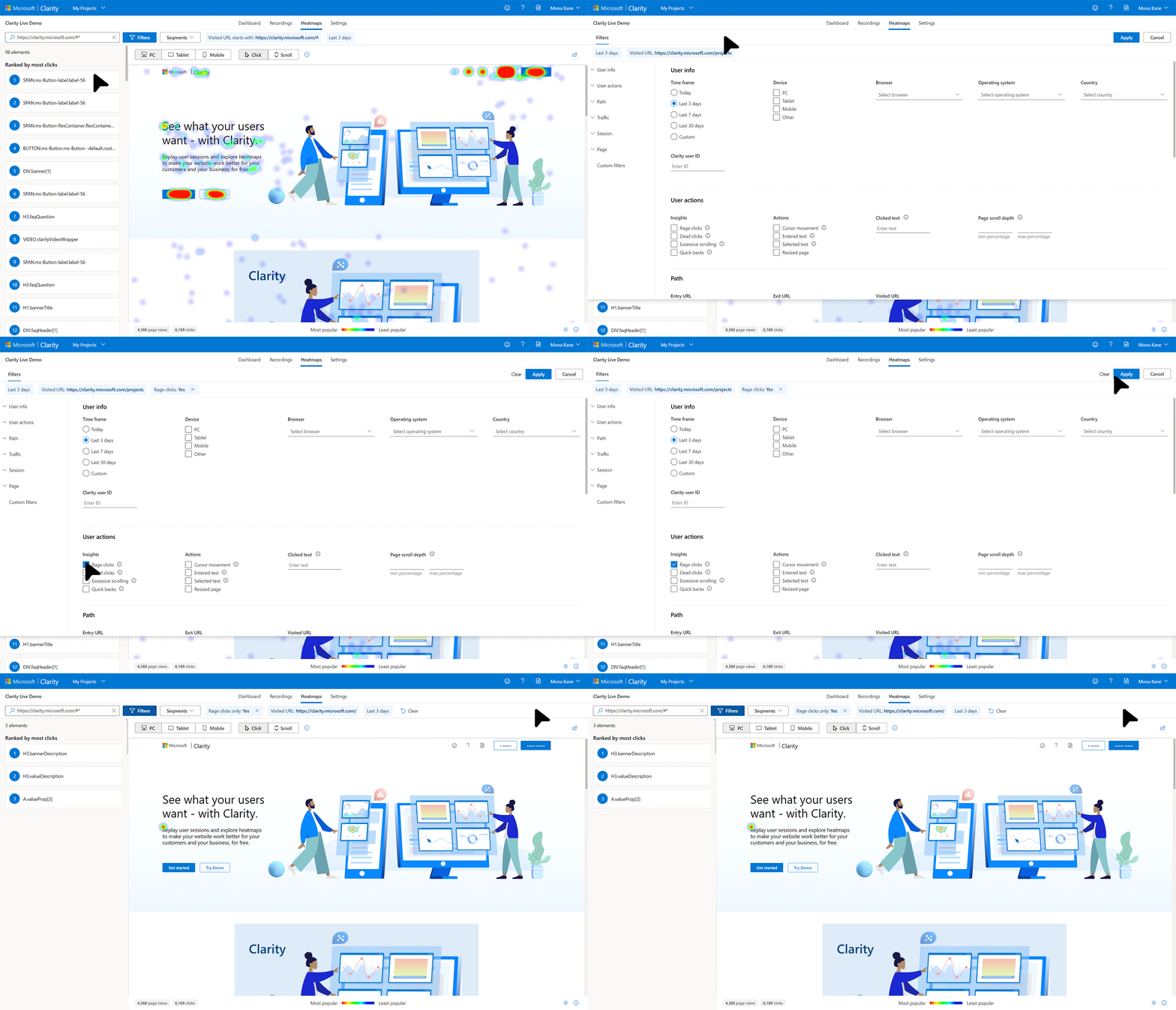
3. Support rage click and dead clicks heatmaps
In addition to viewing click maps for all clicks, you can filter heatmaps to only rage clicks (where the user rapidly clicked or tapped in the same small area) or dead clicks (where the user’s clicked and didn’t get a response)

4. No limits on the number of heatmaps.
Get heatmaps on all your webpages of your site with no extra work or hidden cost.
5. No additional setup required.
After you’ve set up Clarity, there are no more tags to install or settings to configure.
6. Clarity is free, with no traffic sampling.
You can start to gain amazing insights into your user behavior with no costly subscriptions or hidden fees, allowing you to dig into your heat maps retrospectively.
Get started today and get ready to take your understanding of user behavior to the next level.
Source: Bing Blog Feed
